Tag: Responsive Web Design

Banking Just Got Simpler with CedarStone Bank’s New Responsive Website

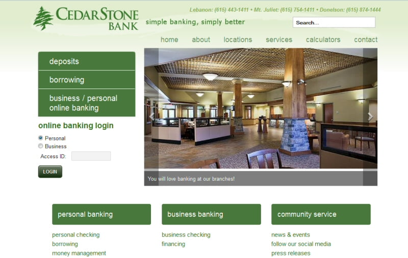
Over the last few months, CedarStone Bank has been working on a new responsive designed website. A responsive website is a website that is mobile, tablet, laptop and desktop friendly and provides an optimum user experience based on the device with which the website is being used.

With the significant increase in mobile and tablet usage over the last 12 months, the need to provide easy website usage (not just access) has never been greater, and CedarStone Bank’s new responsive website site provides a great experience for all website visitors.

The website was custom designed and developed by local company Bear Web Design under the direction of John B. Bryan, CedarStone Vice President, Business Development Officer and Tina Winfree, CedarStone Senior Vice President and Operations Manager.

“The entire CedarStone Bank team is excited about the launching of our new and improved website. CedarStonebank.com is easier to navigate while offering the latest and greatest online banking applications. The responsive design makes it attractive and manageable from most any mobile, laptop or tablet device,” commented Bryan.

“The website project was a product of our bank’s ABC program. In July of 2012 we started a program designed to train and mentor CedarStone Bank employees in becoming aspiring bankers. The Aspiring Bankers of CedarStone (ABC) program was designed to educate, enlighten and develop employees to be well-rounded banking professionals as well as to empower them to make our bank better,” he added.

Incorporating the corporate brand and colors of CedarStone Bank with an exciting array of images and data display widgets, the CedarStone Bank website comes to life with a prominent slideshow and rich content, friendly navigation, and a direct and easy login to mobile banking. A new feature of the website is CedarStone Bank News and Blog, which integrates and publishes directly to social media, keeping customers connected with the latest website news and information in their favorite social media.

We Are Responsive!

Desktop Laptop Responsive Website CedarStone Bank

Laptop and Desktop view gives visitors the full experience, with easy to use navigation and lots of key information accessible from the home page. You can find a branch location easily and our contact forms integrate with Google Maps, allowing you to even get driving directions while staying on the website!

Tablet and Mobile Responsive Website - CedarStone Bank

Mobile & Tablet views will really show you the advantages of responsive design. While launching a great image-based website is becoming the vogue (with large image backgrounds and slideshows becoming more common), the fact is, if that site isn’t easily accessible in a mobile or tablet experience, then a larger and larger user segment base is being overlooked and ignored.

ALWAYS SECURE – security remains CedarStone Bank’s top priority, with the highest standards of website security and protocols being implemented.

SO, like never before, Banking Just Got Simpler with CedarStone Bank’s New Responsive Website.

We look forward to seeing you online and at a CedarStone Bank branch soon!

Bear Web Design launches Responsive Wilson County Fair Website

Over the last few months, Bear Web Design has been working on a new responsive designed website to launch for the 2013 Wilson County Fair. A responsive website is a website that is mobile, tablet, laptop and desktop friendly and provides an optimum user experience based on the device with which the website is being used.

With fair goers using many different devices to access event information — ranging from family planning on a laptop or desktop, to mobile and tablet users checking out their favorite events as they head down I-40 to Lebanon, TN to the Wilson County Fair — the new responsive website site provides a great experience for all website visitors.

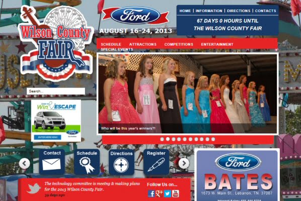
The website was custom designed by our awesome design Team Vicki Beare and Dana Bryson under the direction of Helen McPeak, Nell Stephens & George Wallace. As always with Vicki and Dana, their designs are visually amazing while maintaining excellent functionality. Incorporating an exciting array of image and data display widgets, the Wilson County Fair site comes to life with eye catching graphics and logos, and with great photos from the Fair’s photography team.

Matched with great design is the tremendous content work by Nell Stephens, who manages all content on the website. There are close to 500 event listings for this year’s Fair, and to ensure each event is accurate as well as informative is something Nell has mastered.

To appreciate the full experience I invite you to visit the website on at least 3 devices (mobile, tablet, laptop or desktop) to get a full appreciation for responsive design which is where all of Bear Web Design’s new development efforts have been focused in 2013 – http://www.wilsoncountyfair.net

Laptop and Desktop views will really give visitors the visual experience of being at the Wilson County Fair. As you enter the site you will see a great background photo (which changes daily and really sets the experience for the website visit). Our photo slideshow can quickly take you through several great photos that link to a specific event (or event category) or to any general article in the site.

Of course, the star of the website is the list of events, which are being presented through our new event system which can be accessed via the main menu. For the first time on the Fair website, we are capable of tying event listings to the actual events photograph. We are currently loading event photos for specific events providing you with the capability of reading event details and seeing some great event photos. Another great feature this year is Facebook comments that allow the visitor to post a comment about any event (that is not only shared on the site but also shared in Facebook).

Other key elements include:

  • Sliding icon based navigation system (key fair items such as contacts, vendors, directions, tickets etc.
  • Tab based info (In the right module) that can be clicked on to expand information (click on videos to see the Wilson County Fair video channel)
  • Blogs and News (that automatically update Social Media — Facebook, Twitter, Google+)
  • Digital advertising, with ads designed to effectively promote the Fair’s sponsors and advertisers while fitting aesthetically into the look and feel of the new website.
  • A twitter feed gives the fair a direct broadcast banner which will be used to provide key information updates throughout the Fair.
  • Sponsorship Scroller on the home page, providing great visibility and recognition of Fair sponsors.

Wilson County Fair Responsive Site on iPadMobile & Tablet views will really show you the advantages of responsive design. While launching a great image based website is becoming the vogue (with large image backgrounds and slideshows becoming more common), the fact is, if that site isn’t easily accessible in a mobile or tablet experience, then a larger and larger user segment base is being overlooked and ignored.

The Wilson County Fair’s mobile site provides key drop down menus as well as immediate search options. The key to a good mobile site is navigation, so these items are directly below the new fair logo.

wilson-county-fair-ipad-verticalThe logo and new slideshow are sized to 100% of the mobile device (and tablet when in vertical view) – and you can easily review the great slideshow you see on the desktop with touch-screen navigation to scroll to the next photo.

Touch navigation is relevant in both Mobile and Tablet,  and the behavior of finger touch screens are tested thoroughly by Vicki and Dana (using a variety of iOS, Windows, and Android devices and browsers) to ensure they are easily navigable.

Additionally, the mobile and tablet views are complemented by fully readable events, blogs & articles with access to photos, videos and key information. We even have our sponsors ads running on the mobile sites in 2013 as we are expecting a surge in mobile use this year with up to 25,000 unique visitors.

One important thing to keep in mind is that all of the responsive views use the same data and info as the full desktop site  — so there is only one site to maintain and update. (This is a huge and relatively recent improvement over the days when a mobile site had to be updated separately.)

Introducing the Wilson County Fair’s First Mobile App!

To cap off the new Wilson County Responsive Website we are introducing our first Mobile App (Event App) that is browser based.

This means you don’t have download the app to use it, and it does not require a different download for different operating systems (e.g. i-Phone, Android, Blackberry).

The mobile app comes with a sharp and crisp interface giving you a different look than the actual website event listing and these events are tied to Google Map and  GPS coordinates identifying precisely where the event is taking place in the Fair Grounds.

Wilson County Fair Responsive Site on iPhoneUltimately we are working with this app to have the ability to navigate around the fair with your mobile device while being constantly aware of what events are up and coming. We will be sharing more information on our new mobile app as we progress through its setup.

So like never before you can stay tuned, connected and engaged with the Wilson County Fair.

We look forward to seeing you online and at the Wilson County Fair – August 16-24, 2013!

Responsive Design in 2013!

As 2012 draws to an end, we have lots of new developments (“web developments” that is) on the horizon for the coming year. Most important of these is that our new custom templates will feature Responsive Web Design, also known as RWD — click here for definition.

In a nutshell, RWD is a design approach that optimizes the web browsing experience no matter what web device you happen to be using – desktop, laptop, iPad or other small-screen device, or mobile phone.

We are in the process of finalizing the templates of our newest sites and will provide links, examples and more info in early 2013… stay tuned!

Vicki Beare (this is my new last name — as I mentioned, we had LOTS going on around here lately!)